Overview
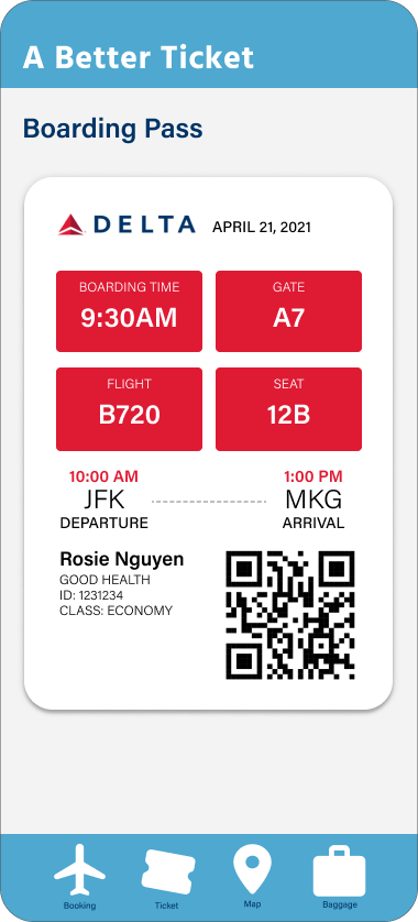
If flying wasn't already stressful enough, trying to read your boarding pass can make users feel even worse. For this project, I had to understand and evaluate the current state of the boarding pass and how I could make it better for users who don't fly frequently or it's the first time flying. By conducting a journey map, I was able to understand and identify problem areas in the printed boarding pass/luggage pass and how I can transition that solution into a mobile experience.
Deliverables: Printable Ticket, and Mobile Ticket
What's the Probelm?
The boarding pass and luggage ticket need a better visual hierarchy to make it easier to find information but still make it functional for the airport. These tickets are also awkwardly shaped and can be difficult to store.
Printed Boarding Pass
Part of my solution was to create a boarding pass that is universal from airline to airline and is roughly the size of a business card. On the back of the card you can find bagging information and that eliminates the need for another printed ticket.
Wire-Frame for Mobile
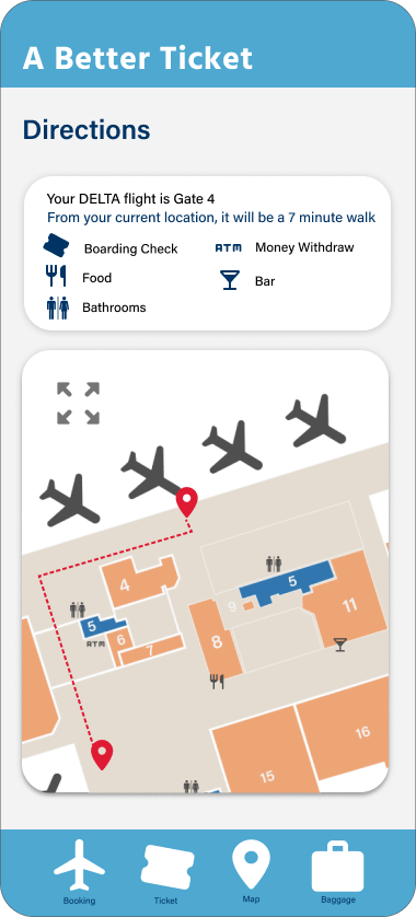
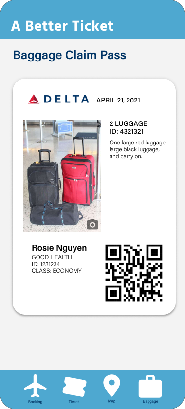
I considered what users would want in an app that helps them enjoy their flighting experience. In this app, users can also store their boarding passes, and luggage tickets and also help them navigate around the airport.
