Overview
Through research, testing, and understanding, a team and I created a new packaging design for Always period pads. The team discovered that there were many challenges with the current Always packaging. Our goal as a team was to find the best solution by using UX methods to understand users and to test our understanding.
Deliverables: Packaging
My Role: Researcher, Designer, Prototyping
My Team: Kathern, Isabela, and Jeffery
My Role: Researcher, Designer, Prototyping
My Team: Kathern, Isabela, and Jeffery
What's the Problem?
• Once the plastic wrap of the package is ripped, it can no longer be sealed.
•Label is not discreet and can cause embarrassment to some users.
• Users have to buy multiple sizes for their household or themselves.
•Label is not discreet and can cause embarrassment to some users.
• Users have to buy multiple sizes for their household or themselves.
Who is the Target Audience?
• Young teens and adults.
• Transgender male who still menstruates.
• Households with multiple women.
• Transgender male who still menstruates.
• Households with multiple women.
Process
From our research, my team created different solutions that would help solve the re-sealable container issue, and through our research, we learned that users wanted a variety pack of different size pads.
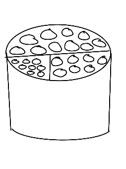
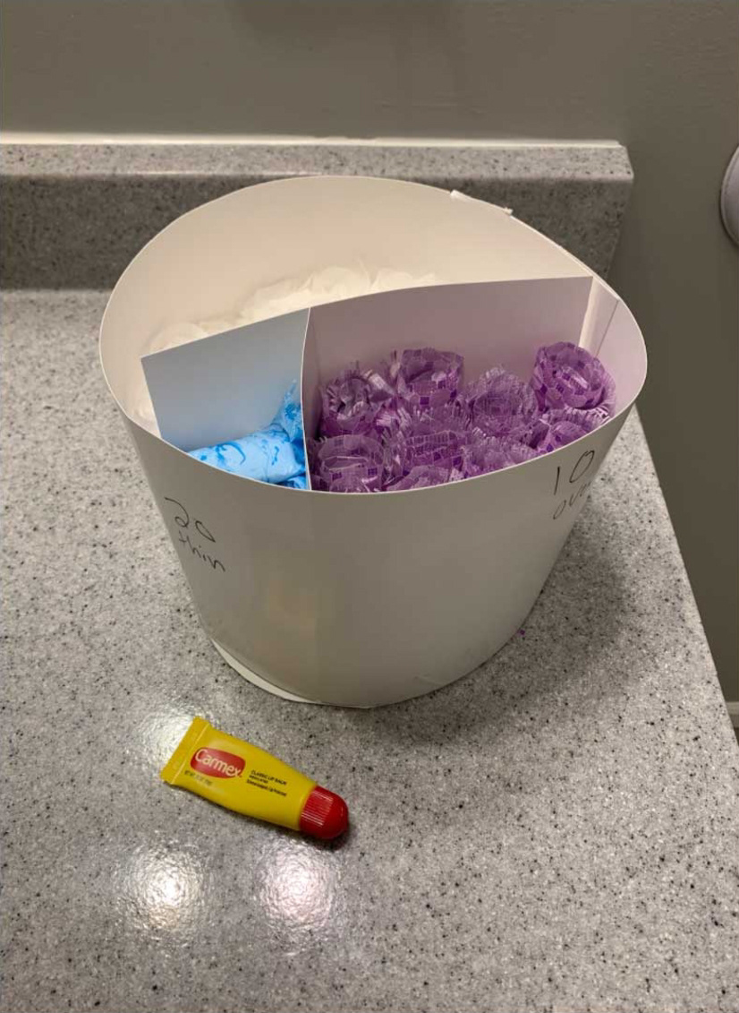
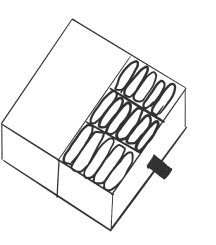
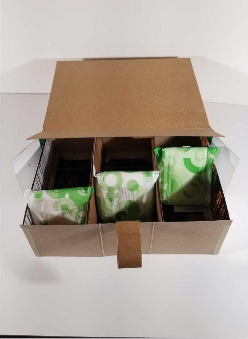
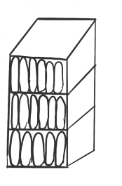
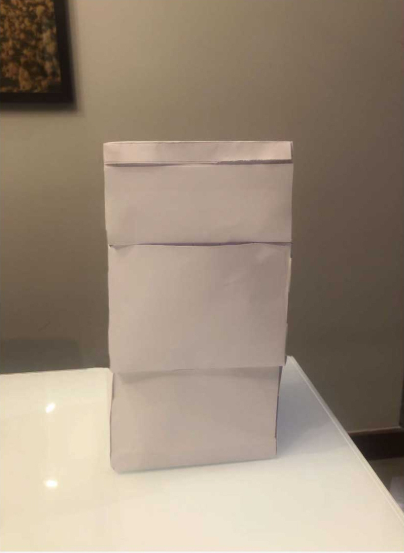
After getting insight from users, we made adjustments and came up with a container with a liftable lid.
New Packaging
After working through our research, I made renderings of the container with the help of team members.
A neutral pattern was made by a team member that used Always branding. I created a removable label that would wrap around the box. This choice was made because users wanted a box that would be discrete after purchasing.
This information was included inside the box to help assist users if they ever needed it and to prevent it from being on the label.
On the label, users can see what sizes are in the box. I created a visual of what the pad looks like for those who are still learning about pads and the kinds of pads they like.
Different packaging and label to help identify the different sizes
